

Product Design
UI/UX Designer, Iconography, User Testing
2024
Snaptrude is a cloud-based concept design tool for architects and interior designers, bridging the gap between early-stage design exploration and Building Information Modelling (BIM). It simplifies workflows, enhances collaboration, and empowers users to design from scratch in a structured yet flexible environment.
This project focused on user testing and experience evaluation of Snaptrude’s interface, particularly around navigation panels, iconography, and usability. The aim was to identify friction points, refine design clarity, and ensure smoother, more intuitive interactions for end users.
Summary
Challenge
While Snaptrude offers a powerful BIM-enabled design platform, several usability barriers emerged:
-
Ambiguous iconography made it difficult for users to interpret actions.
-
Inconsistencies in interaction (multiple arrow icons with different functions).
-
Hidden properties limited discoverability and slowed down workflows.
-
Lack of visual hierarchy reduced efficiency and made task prioritization unclear.
The challenge was to resolve these friction points without overloading the interface or compromising Snaptrude’s streamlined design ethos.
Solutions
The redesign implemented the following solutions:
-
Discarded the non-functional arrow icon to reduce noise.
-
Designed new icons that distinctly represent adding basement storeys and higher floors.
-
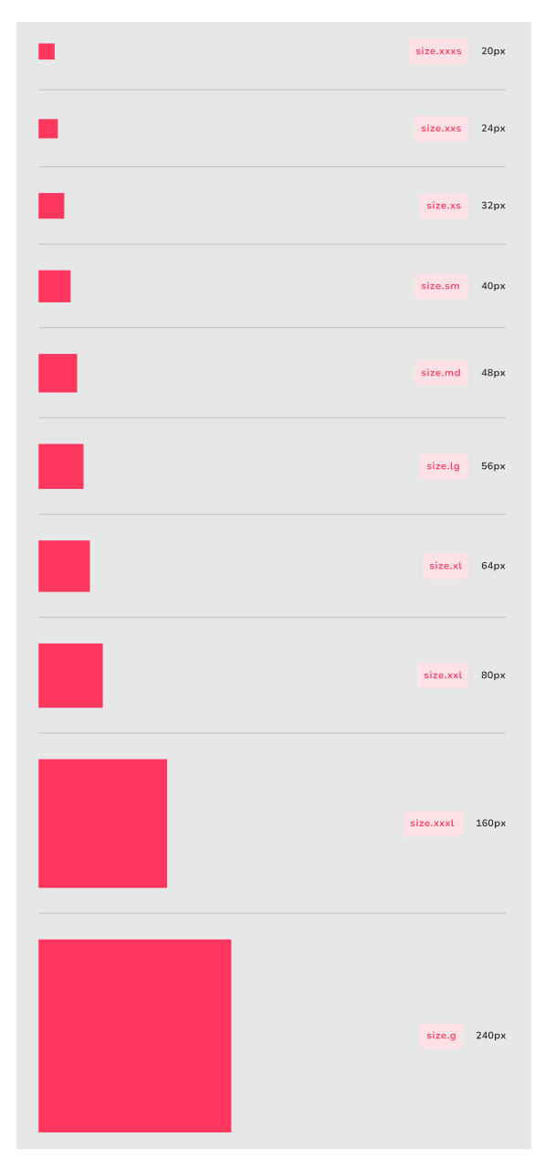
Unified style guide for icons across the Storeys Panel.
-
Created predictable patterns for actions (add, delete, expand).
-
Grouped storey functions and layer properties into one structured view.
-
Elevated primary actions (add/delete storey) while keeping secondary options contextual.
This highlighted the importance of micro-interactions and iconography in shaping the user experience of professional design tools. By focusing on clarity, consistency, and hierarchy, we transformed a confusing panel into a seamless design workflow component.


